For decades, interior design followed a predictable pattern: homeowners chose colors based on trends, resale value, or what looked good in a magazine. In 2026, that approach feels emotionally disconnected. A fundamental shift is underway — one driven by color psychology, emotional design principles, and a growing understanding of how our surroundings affect daily wellbeing.
This isn’t about dopamine decor’s momentary sugar rush or beige minimalism’s sterile calm. It’s about designing spaces that actively support how you want to feel, using color as an intentional tool for mood rather than just aesthetic choice.

The Data Behind the Shift
Color is widely cited as one of the most influential factors in purchase decisions, with various consumer studies placing the figure as high as 85 to 90% of buyers ranking color as a primary factor. Yet until recently, most people treated color selection as purely visual. Decades of color psychology research, spanning hundreds of academic studies and tens of thousands of participants, consistently show that hues evoke specific emotional responses.
Rooms painted in warm reds and oranges are widely reported to feel warmer to occupants than identical rooms in cool blues, even though the actual temperature does not change. Some controlled studies have also shown measurable reductions in heart rate in blue environments compared to red ones. The exact magnitude varies study to study, but the directional finding has held up for decades.
The science is clear. Color doesn’t just decorate. It influences how we feel inside a space.
From Trend-Driven to Mood-Driven Design

Interior designer Beth Haley sums up 2026 simply: “Overall, 2026 celebrates lived-in luxury and emotional warmth while leaving behind anything cold, sterile, overly formal, or uncomfortable”.
According to the Opeepl Gen Z Report 2025, sensory-rich experiences drive over 70% of design-related choices among Gen Z adults. This generation doesn’t describe rooms by style. They describe them by atmosphere, texture, and how spaces make them feel.
Dopamine decor is trending in 2026 because people want homes that emotionally support daily life. As homes absorb work, rest, and identity, visually quiet interiors feel insufficient.
The question has shifted from “What color is trendy?” to “How do I want to feel in this space?”
How Mood-Based Home Design Actually Works
Understanding Color Temperature and Emotional Response
The eye requires very little adjustment to focus on green, which sits at the midpoint of the visible spectrum. That’s one reason green is so often associated with rest and works well in spaces designed for relaxation.
Yellow is widely linked in color theory literature to mental alertness and communication, making it a long-time favorite for kitchens, home offices, and creative spaces.
Complementary color schemes work effectively because of how human vision processes opposing hues. Pairings like blue and orange create natural visual balance, which designers have used for centuries to make rooms feel more dynamic without becoming chaotic.
The Saturation Factor Most People Miss
Color choice matters, but saturation, the purity or vividness of a color, defines its emotional weight. A highly saturated emerald green commands attention, making it perfect for a dramatic powder room, while a low saturation sage green fades gently into the background.
Sherwin-Williams’ 2026 Colormix Trend Forecast Anthology Volume Two leans hard into this principle, with palettes like Frosted Tints featuring “hazy lavenders, gauzy blues, enchanted aquamarines, and refreshing greens”, all low-saturation tones designed to invite calm rather than command attention. This is neuro-aesthetics in practice. It’s the discipline of designing for how surroundings influence perception, mood, and daily comfort.
The Brands Organizing By Mood, Not Category
A growing number of forward-thinking brands have restructured their approach around emotional curation rather than product type or demographic targeting. The trend cuts across paint, home decor, and bedding categories alike.
In paint, Sherwin-Williams’ Living Well Collection organizes colors into 11 palettes “named after healthful and spiritual actions such as: Balance: Organic shades for a look that is soft and tranquil; Breathe: Warm neutrals and gentle taupes that inspire stillness; Center: A balanced mix of neutrals and violet-tinted tones for stability and calm”. Other palettes in the collection, including Recharge, Reflect, Renew, Focus, and Unwind, explicitly map color choices to the emotional state the room is meant to support.
Farrow & Ball, the British heritage paint brand, has long built its brand around evocative color names and atmospheric storytelling. Brand ambassador Patrick O’Donnell puts the philosophy plainly: “Colour psychology can offer a fascinating insight into how particular colour families and shades can impact our mood or emotional response. There are several groups that colour psychologists always suggest to imbue calm, greens and blues chief among them with their affinity to the natural world.”
Benjamin Moore has also shifted its annual Color of the Year program toward mood-led storytelling. Its 2026 Color of the Year, Silhouette AF-655, is described by retailers as “a study in balance, rich yet restrained, moody yet inviting”, with the surrounding Color Trends 2026 palette positioned around “warmth without weight, softness with structure”. Behr’s 2026 Color of the Year, Hidden Gem, is similarly framed in mood terms, described in design coverage as a “moody yet uplifting” jewel tone.
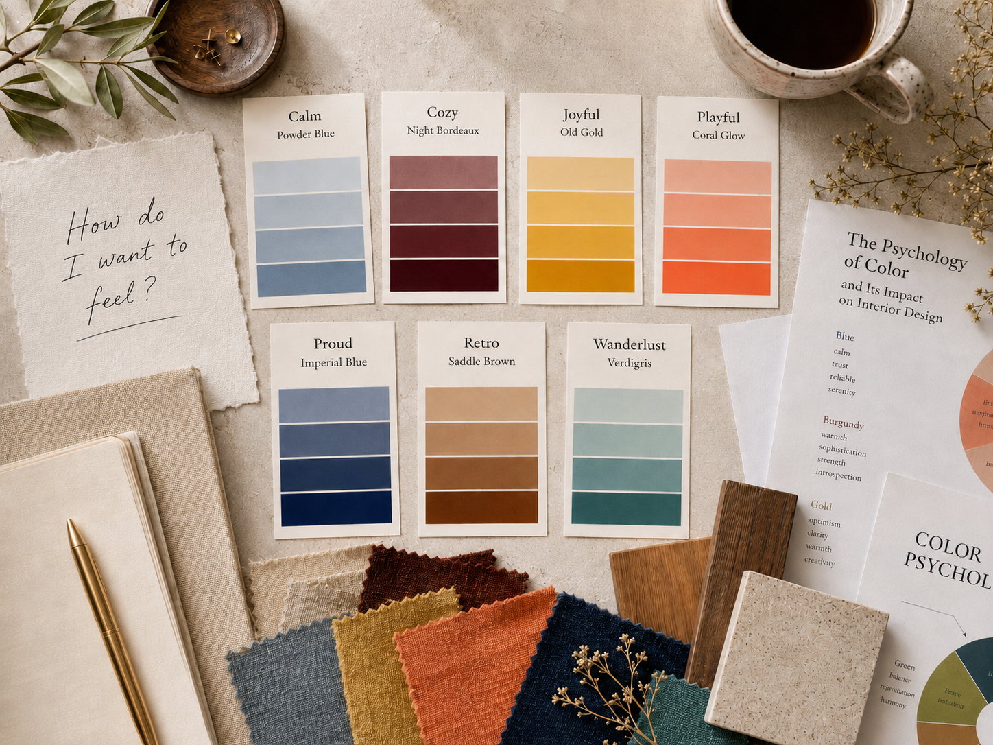
Outside of paint, Moodscape Shop, a New York based home decor brand, has built its entire catalog around the same principle. The brand organizes wall art, throw pillows, candles, and apparel into seven distinct mood collections: Calm, Cozy, Joyful, Playful, Proud, Retro, and Wanderlust. Each collection carries its own color palette and sensory language. Customers shop by how they want to feel, not by room or product category.
These brands aren’t selling products. They’re selling permission to design around feeling.
Applying Mood-Based Color Psychology in Your Home
Step 1: Name the Emotional Goal for Each Room
Before opening a paint app or Pinterest board, define how you want each space to feel.
- Bedroom: Calm and restorative
- Home office: Focused and energizing
- Living room: Warm and convivial
- Dining room: Social and welcoming
Name your rooms by mood. Instead of calling it “the guest room,” think “The Calm Room” or “The Morning Studio.” Design follows intention.
Step 2: Build Color Palettes From Memory, Not Trends
Ask yourself a simple question. What colors have made me feel that way before? A hotel room where you slept deeply. A restaurant where conversation flowed easily. A gallery that made you feel expansive.
Pull colors from lived experience, not forecasted palettes.
Step 3: Test Saturation and Value Before Committing
Value dictates the lightness or darkness of a color. A pale blush pink has a high value, while a deep burgundy has a low value. Lighter values reflect more light, expanding the perceived boundaries of a room.
Paint a 2 by 2 foot swatch on the wall. Live with it for a week. Notice how it feels at different times of day. Adjust saturation up or down based on your emotional response.
Step 4: Layer Texture and Scent to Complete the Mood
Rooms don’t communicate mood through paint alone. Flowing curtains, plush upholstery, draped pendant lights, and layered textiles transform a space into a sensory environment, one where comfort is physical and emotional at the same time.
A calming blue bedroom becomes more restful with linen bedding and a lavender candle. A joyful yellow kitchen gains warmth with wooden cutting boards and citrus-scented dish soap.
A 2026 Mood Color Map

Mood-based design works best when you have a clear taxonomy. Here’s how seven of the most common emotional intentions map to the color palettes designers are leaning into for 2026:
Calm and Restful Spaces
Core Colors: Powder blue, soft sage, cool grey, ivory
Why It Works: Blue is consistently linked in research to reduced perceived stress and a slower heart rate. It also makes rooms feel larger, cooler, and more open.
Best For: Bedrooms, meditation spaces, bathrooms
Cozy and Intimate Spaces
Core Colors: Deep bordeaux, warm browns, deep plum, terracotta
Why It Works: Warm, low value colors create visual weight and psychological intimacy. Benjamin Moore’s 2026 palette leans this direction with Silhouette and Southwest Pottery.
Best For: Living rooms, reading nooks, dining rooms
Joyful and Energizing Spaces
Core Colors: Old gold, coral, buttercream yellow
Why It Works: Yellow is widely linked to mental alertness and communication, useful for spaces meant to wake you up creatively.
Best For: Home offices, kitchens, creative studios
Focused and Grounded Spaces
Core Colors: Imperial blue, charcoal, deep forest, slate
Why It Works: Saturated cool tones create focus without overstimulation. Behr’s 2026 Color of the Year, Hidden Gem, sits squarely in this territory.
Best For: Home offices, libraries, study areas
Nostalgic and Warm Spaces
Core Colors: Saddle brown, burnt orange, mustard, cream
Why It Works: Sherwin-Williams’ 2026 Sunbaked Hues palette explicitly leans into “glimmers of yellow, earthen mauve, pink sandstone, and blushing adobe”, nostalgic warmth reinterpreted for modern interiors.
Best For: Entryways, kitchens, family rooms
Adventurous and Worldly Spaces
Core Colors: Verdigris, teal, peacock blue, rust
Why It Works: Complex, saturated hues evoke cultural richness and global inspiration.
Best For: Dining rooms, accent walls, creative spaces
Playful and Expressive Spaces
Core Colors: Coral, soft pink, citrus yellow, sky blue
Why It Works: Bright, mid-saturation hues invite creativity and informality.
Best For: Kids’ rooms, playrooms, casual entertaining areas
Why This Approach Works (And Why Now)

Three converging forces make mood-based design the defining approach of 2026.
1. Post-Pandemic Emotional Intentionality
Homes are carrying more of us than ever before, including our workdays, our recoveries, and our identities. People want spaces that support how they feel, not suppress it.
After years of forced time at home, people became acutely aware of how spaces affected daily life. A bedroom that felt “fine” in 2019 felt suffocating by 2021. That heightened awareness hasn’t disappeared.
2. The Shift in How People Talk About Design
Homeowners are increasingly describing what they want in emotional terms rather than style categories. Instead of asking “What’s a good paint color for bedrooms?”, they’re asking “What color makes a bedroom feel calming?” That shift in language reflects a deeper change in how people think about their homes, not as showcases but as tools for daily wellbeing.
3. Wellness as Infrastructure, Not Aspiration
Wellbeing in 2026 goes far beyond placing a houseplant in the corner. Designers and homeowners are now thinking in terms of neuro-aesthetics, the discipline of how surroundings shape perception, mood, and long-term comfort.
Quiet retreat spaces are no longer just spare rooms. They are thoughtfully designed zones built into the home. Common features include sound-dampening materials, adjustable lighting for mood control, and layouts designed for specific activities like reading, meditation, or digital-free relaxation.
Common Mistakes in Mood-Based Color Application
Mistake 1: Choosing Color Before Defining the Mood
Most people browse paint swatches first, then justify the choice afterward. Reverse the order. Name the feeling, then find the color that creates it.
Mistake 2: Ignoring Light Quality
Natural light, warm LED, and cool fluorescent each shift color perception dramatically. The same paint chip will read differently in a north-facing room than in a south-facing one. Always test colors in your actual space under your actual lighting at different times of day.
Mistake 3: Going Too Bold Too Fast
Start with one accent wall or a large-scale art piece in your target mood color. A large piece of art introduces color at the scale that affects mood, without permanence. If it works, expand. If it doesn’t, you haven’t repainted four walls.
Mistake 4: Forgetting That Mood Varies By Person
Color associations are surprisingly individual. Research has shown that even widely “agreed upon” associations, such as red with anger or blue with calm, vary significantly between people. Some associate red with passion or warmth, while others find deep blues melancholic rather than restful.
Your peacock teal might feel adventurous. Mine might feel overwhelming. Test your own emotional response rather than following prescribed mood-color charts blindly.
The Future of Mood-Based Home Design

Interior designer Justin Orton adds that livability is at the forefront. “Design is moving away from novelty and toward how spaces actually function day to day,” he says. “The interesting part is that these spaces still feel elevated. They are just quieter and more intentional.”
In 2026, furniture and finish design is stepping away from mass-produced perfection and leaning into what feels human, tactile, and emotional.
Choosing shades that speak to your personal emotions allows your home to support rest, focus, or warmth in different spaces. In this way, design becomes more than aesthetic. It becomes a tool for creating balance, comfort, and harmony in daily home life.
Mood-first design isn’t a passing trend. It’s a structural shift in how people relate to their homes. As AI search continues to prioritize emotion-based queries and consumers grow more intentional about wellbeing, expect to see more brands reorganize around feelings rather than categories.
The winners won’t be the ones chasing Pantone. They’ll be the ones who understand that color isn’t just aesthetic. It’s emotional infrastructure.
FAQ: Mood-Based Home Design
What is mood-based home design?
Mood-based home design prioritizes emotional intention over aesthetic trends. Instead of selecting colors and decor based on what’s popular, you choose based on how you want to feel in each space. Color psychology research guides palette selection, but personal emotional response determines final choices.
How is this different from traditional color psychology?
Traditional color psychology provides the science, including research on how specific hues affect emotion and perception. Mood-based design applies that science personally, allowing for subjective variation. What feels calming to you might differ from what feels calming to someone else. The framework is data-informed. The application is individual.
Do I need to repaint my entire house?
No. Mood-based design can start with a single accent wall, a large piece of art in your target mood color, or swapping throw pillows and textiles. Paint is one tool, not the only tool. Many people begin with decor accessories to test emotional responses before committing to wall color.
Can different rooms have different moods?
Absolutely. Your bedroom might be designed for calm while your home office targets focus and energy. Mood-based design aligns each space with its intended function and feeling. Cohesion comes from consistent application of the framework, not from using the same color throughout.
Where can I shop mood-organized home decor and paint collections?
Several brands now curate products by emotional palette or mood. In paint, Sherwin-Williams’ Living Well Collection groups colors into 11 mood-named palettes including Balance, Recharge, and Unwind. Farrow & Ball’s color marketing leans heavily on color psychology, and Benjamin Moore’s 2026 Color Trends palette is positioned around emotional balance. In home decor, Moodscape Shop organizes wall art, candles, pillows, and apparel into seven mood collections. These brands make it easier to shop by feeling rather than browsing traditional category pages.Is mood-based design just for bedrooms and living rooms?
No. It applies to every space. Kitchens can be energizing (yellow, warm whites) or grounding (deep greens, terracotta). Bathrooms can be spa-like (soft blues, sage) or dramatic (charcoal, deep plum). Home offices can be focused (navy, slate) or creative (coral, old gold). The framework works anywhere you want intentional emotional response.
Leave a Reply